You can write a helpful blog post.
You can answer the reader’s question.
You can even recommend a product that genuinely fits what they need.
And then, right at the end, you can lose them with three little words:
Click here now.
The problem isn’t that calls-to-action don’t work.
The problem is that we sometimes treat the call-to-action as an afterthought.
We spend all our time creating the content and then tack on a button, link, or sentence telling the reader what to do next.
But a good call-to-action should do more than ask for a click.
It should make the next step feel clear and logical.
A CTA Is a Bridge
Think of your call-to-action as a bridge between where your reader is now and where they could go next.
Your content has helped them understand something.
Now what?
Maybe the next step is:
- Read another article
- Download a free resource
- Join your email list
- Learn more about a tool
- Look at a product
- Start a free trial
- Make a purchase
Those are very different actions.
And that’s where many CTAs go wrong.
We ask people to take the action we want instead of thinking about the action that makes the most sense for them.
Mistake #1: Asking for Too Much Too Soon
Imagine someone has just discovered your blog for the first time.
They’ve read one article.
They barely know who you are.
Then the article ends with:
BUY THIS NOW!
Could it work?
Sure.
But for many readers, that’s a pretty big jump.
A smaller next step might make more sense.
You could invite them to read a related article, download a helpful resource, join your email list, or learn more about the solution you’re discussing.
This doesn’t mean you should never ask for the sale.
It means the size of the ask should make sense for where the reader is.
Mistake #2: Being Too Vague
Here’s another common CTA:
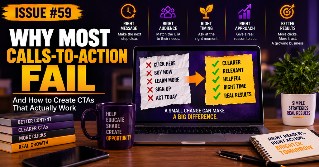
Click here.
Okay…
Why?
What happens after I click?
What am I going to see?
Why should I care?
Compare that with something like:
See how the tool works and decide whether it fits your business.
Now the reader knows what they’re getting and why the click might be worth their time.
Clarity reduces uncertainty.
And uncertainty is one of the easiest ways to lose a click.
Mistake #3: Giving People Too Many Choices
Sometimes we’re so afraid of missing an opportunity that we give readers everything.
Read this.
Download that.
Follow me here.
Check out this product.
Join this program.
Subscribe to the newsletter.
Oh, and don’t forget this other thing.
When everything is the next step, nothing is the next step.
A strong CTA usually answers one simple question:
What is the most useful thing this reader could do next?
Give that action priority.
You can always introduce other opportunities later.
Mistake #4: Forgetting the Benefit
People aren’t clicking because you need clicks.
They’re clicking because they expect something useful on the other side.
That’s why a CTA should usually communicate some kind of benefit.
Instead of:
Join my email list.
You might say:
Get practical affiliate marketing tips delivered to your inbox each week.
Instead of:
Check out this tool.
Try:
See whether this tool could simplify the part of your business we just discussed.
You aren’t promising a miracle.
You’re simply giving the reader a reason to continue.
Mistake #5: Using the Same CTA for Everyone
We’ve talked before about the difference between browsers and buyers.
That matters here too.
Someone who is still learning about a problem may need a completely different next step than someone who is actively comparing solutions.
A browser might be ready to:
Learn more.
A subscriber might be ready to:
See the tool I recommend.
And someone already looking for a solution might be ready to:
Get started.
The goal isn’t to find one magical CTA that works everywhere.
It’s to match the CTA to the reader, the content, and the moment.
Helping and Selling Can Meet at the CTA
In the last issue, we talked about the difference between marketing and helping.
This is one place where the two can work together beautifully.
You’ve helped someone understand a problem.
You’ve given them useful information.
Maybe you’ve explained their options.
If you know of a resource, product, or next step that could genuinely help them move forward, telling them about it isn’t suddenly a bad thing.
The CTA simply says:
Here’s what you can do next if you want to keep going.
The reader still gets to decide.
Try the “Next Logical Step” Test
Before adding a CTA to your next blog post or email, ask yourself:
If I were the reader, what would feel like the most logical next step after reading this?
Then check three things:
- Is the action clear?
- Does the reader understand why they should take it?
- Is it appropriate for where they are right now?
If the answer is yes to all three, you probably have a much stronger CTA.
You Don’t Need to Push Harder
When a CTA isn’t working, the answer isn’t always to make the button bigger, add more urgency, or use stronger sales language.
Sometimes the problem is much simpler.
The reader isn’t ready.
The benefit isn’t clear.
There are too many choices.
Or the action doesn’t naturally follow what they just read.
Fix the connection between the content and the next step first.
Because the best calls-to-action don’t feel like someone suddenly switched from helping you to selling you.
They feel like a natural continuation of the conversation.
Right reader. Right action. Right time.
That’s a much better place to start.
Leave a Reply